

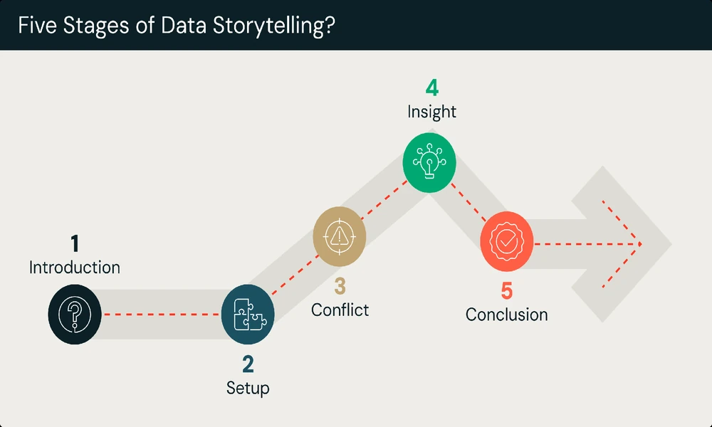
Businesses generate enormous amounts of data every day. From sales figures and customer behavior to website traffic and operational performance, organizations have access to more information than ever before.
However, having data is not the same as understanding it.
Charts, spreadsheets, dashboards, and reports can present large quantities of information, but they do not always make the meaning behind the numbers immediately clear. This is where data storytelling becomes valuable and why many companies turn to ImageThink for this valuable service. By combining analysis, visualization, and narrative, organizations can turn complex information into insights that people can understand and act upon.
What Is Data Storytelling?
Data storytelling is the practice of communicating insights from data through a combination of evidence, visualizations, and narrative.
Instead of simply presenting a chart and asking an audience to interpret it independently, a data-driven story provides context. It explains what happened, why it matters, and what the audience should take away from the information.
For example, a sales report might show that revenue declined by 12% during a particular quarter. A basic report presents the number. A stronger presentation might explain that the decline was concentrated in one customer segment, occurred after a pricing change, and was partially offset by growth in another market.
The second approach gives the audience a reason to pay attention to the number.
Why Numbers Alone Are Not Always Enough
Raw data can be difficult to interpret, especially when an audience does not work with analytics regularly.
A spreadsheet containing hundreds of rows may technically contain all the necessary information, but finding the important insight can require significant time and effort.
Effective communication helps reduce this cognitive burden.
A well-designed data story identifies the most relevant information and presents it in a logical sequence. Instead of overwhelming people with every available metric, it focuses attention on the evidence that supports the central message.
This can make reports easier to understand and decisions easier to make.
The Three Core Elements
Effective data storytelling generally brings together three important components: data, visuals, and narrative.
- Data
The foundation is accurate and relevant data.
Before creating a presentation or report, analysts need to understand what the data actually represents. This includes identifying trends, comparisons, anomalies, relationships, and other meaningful patterns.
Good storytelling starts with good analysis. A visually impressive presentation cannot compensate for inaccurate data or a misleading interpretation.
- Visualization
Charts and other visual elements help audiences recognize patterns more quickly than they might from text or tables alone.
The type of visualization should match the question being answered.
For example:
- Line charts can show changes over time.
- Bar charts can compare categories.
- Scatter plots can illustrate relationships between variables.
- Maps can communicate geographic patterns.
- Tables can be useful when precise values matter.
The objective is not to include as many charts as possible. Each visual should serve a clear purpose.
- Narrative
The narrative connects the evidence and gives it meaning.
A strong narrative can answer questions such as:
- What happened?
- Why did it happen?
- Why does it matter?
- What should happen next?
This creates a logical path that allows the audience to follow the analysis rather than trying to interpret every data point independently.
Start With the Audience
One of the most important principles is to understand who will consume the information.
An executive team may want a concise overview of business performance and the implications for strategy. A marketing team may need detailed information about campaign performance and customer segments. An operations team may require more granular metrics to identify bottlenecks.
The same dataset can therefore produce very different stories depending on the audience.
Before designing a report or presentation, consider what the audience already knows, what decisions they need to make, and what information they actually need.
Focus on the Most Important Insight
A common mistake is trying to tell the audience everything.
More data does not necessarily produce a better story. In fact, excessive information can hide the most important insight.
A stronger approach is to identify the central message first.
Suppose a company discovers that customer acquisition costs have increased significantly. Instead of presenting dozens of marketing metrics, the analysis might focus on which channels contributed most to the increase and whether those channels are still generating profitable customers.
Once the central insight is established, supporting evidence can be selected around it.
Context Makes Data More Useful
Numbers rarely have meaning without context.
A website receiving 100,000 visitors may sound impressive, but the number becomes more meaningful when compared with previous months, industry benchmarks, conversion rates, or business objectives.
Context allows audiences to understand whether a result is positive, negative, unusual, or expected.
Useful comparisons might include:
- Current performance versus previous periods
- Actual results versus targets
- One customer segment versus another
- One marketing channel versus another
- Performance before and after a major change
These comparisons can transform isolated numbers into meaningful observations.
Avoid Misleading Visualizations
Visual design plays an important role in how audiences interpret information.
Charts should make relationships easier to understand rather than exaggerating them. Inappropriate scales, excessive decoration, or unnecessary visual elements can distort the message.
For example, a truncated axis can make a relatively small difference between two values appear enormous. Similarly, using too many colors or visual effects can distract attention from the actual data.
Good visualization is often simpler than people expect.
Clear labels, appropriate scales, readable typography, and a focused layout can make a chart substantially more effective.
Turning Insights Into Decisions
The ultimate purpose of data storytelling is not simply to make reports more attractive. It is to help people understand information and make better decisions.
A strong data story should connect findings to implications.
For instance, an analysis might reveal that a particular product category has experienced declining sales despite increasing website traffic. The important question is not only what happened but what the company should consider doing about it.
Possible implications could involve pricing, product positioning, customer experience, inventory, or marketing strategy.
Connecting evidence to potential action makes analytics more useful to decision-makers.
Data Storytelling in Different Industries
The approach can be applied across many fields.
In healthcare, data can help communicate patient outcomes and operational trends. In finance, analysts can use visual narratives to explain investment performance or financial risks. Marketing teams can tell stories about customer behavior and campaign effectiveness.
Educational institutions can use data to understand student performance, while nonprofit organizations can communicate the impact of their programs to donors and stakeholders.
Regardless of the industry, the underlying principle remains similar: make information understandable, relevant, and actionable.
Using Technology to Improve Data Communication
Modern analytics platforms have made it easier for organizations to create interactive dashboards and reports.
Users can filter information, explore different segments, compare periods, and investigate trends without creating an entirely new report for every question.
However, technology should support the story rather than replace it.
An interactive dashboard containing dozens of charts may still leave users wondering what they are supposed to notice. Good design and clear communication remain essential even when advanced analytics tools are available.
Building a Strong Data-Driven Culture
Data storytelling can also contribute to a broader data-driven culture.
When employees become more comfortable interpreting and communicating data, organizations can make analytical thinking part of everyday decision-making.
Instead of relying entirely on intuition or isolated opinions, teams can discuss performance using shared evidence.
This does not mean every decision needs to become purely quantitative. Experience and judgment remain important. Rather, data provides another layer of evidence that can make those decisions more informed.
The Future of Communicating Data
As organizations continue collecting larger amounts of information, the ability to communicate insights effectively will become increasingly important.
Artificial intelligence and automated analytics can help identify patterns and generate reports, but people still need to understand which findings matter and how they should be communicated.
The strongest data stories will combine reliable analysis with clear visual communication and thoughtful interpretation.
Conclusion
Data storytelling bridges the gap between information and understanding.
Instead of simply presenting numbers, it provides context, highlights important patterns, and explains why the findings matter. By combining accurate data, effective visualizations, and a clear narrative, organizations can communicate complex information in a way that encourages understanding and action.
In a world where businesses have more data than ever, the ability to tell a clear story with that data can be just as valuable as the ability to collect it.